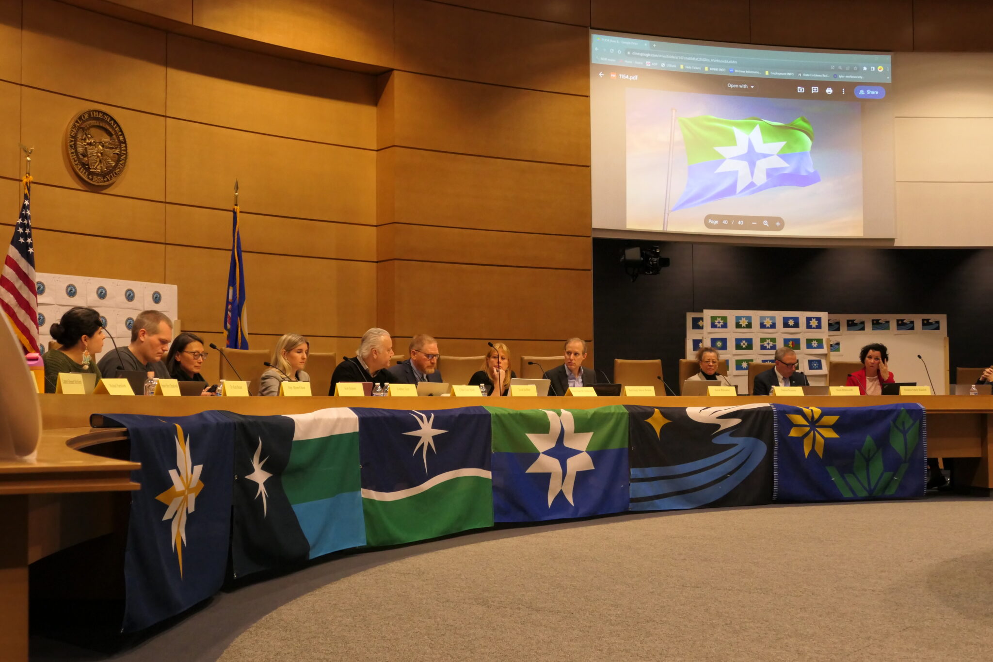
Madison McVan/Minnesota Reformer – The State Emblem Redesign Commission selected three finalists for the new Minnesota state flag Tuesday and made changes to the new state seal design.
The flag designs may still be modified by the commission.
Here are the three finalists for the new state flag:


The commissioners addressed some of the negative feedback they’ve received from Minnesotans, particularly in media reports. A couple of commissioners expressed dissatisfaction with the final crop of designs.
“The question is, can Minnesotans identify with this or not? What I’m reading is no, they don’t,” said state Sen. Steve Drazkowski, a Mazeppa Republican who is a non-voting member of the commission, in a statement that could foretell a partisan divide over changing the symbols of Minnesota’s past.
Republicans weren’t the only skeptics on the commission, however. Denise Mazone, who was appointed to the commission by the Council on Minnesotans of African Heritage, said she didn’t see the state’s African American community reflected in any of the final flag designs.
The commission’s next meeting is scheduled for Friday, Dec. 15.
Changes made to final seal design
Minnesota’s new state seal will feature a red-eyed loon, trees — not to be confused with mountains — and “Mni Sóta Makoc̣e” the Dakota phrase meaning “land where the waters reflect the sky.”

The commission made the changes to the final seal design after a couple hours of debate, largely over how to bring together Indigenous and non-Indigenous perspectives on Minnesota history in the state emblems.
The year 1858, for example, is the year Minnesota was admitted to the United States and was included in the original version of the final seal design.
“As a Dakota citizen … 1858 for us signifies land cession treaties, and it signifies a very, very difficult time in our history,” said Kate Beane, a voting member of the commission appointed by the Capitol Area Architectural and Planning Board. “It’s a traumatic date to be looking at.”
The commission ultimately voted to remove the year from the seal.
A similar debate played out when the commission discussed the inclusion of the state motto, “l’etoile du nord,” which is French for “star of the north.” The commission considered translating the motto to Dakota, but ultimately decided to remove the motto from the state seal over concerns that it would violate the commission’s mandate to represent a “one Minnesota” and not single out particular communities.
Beane advocated for inclusion of “Mni Sóta Makoc̣e” on the seal in lieu of the translated motto, and the commission approved the change despite Secretary of State Steve Simon’s position that the use of Dakota language could be a violation of the commission’s instructions.
“Since this is an item of some controversy, even potential legal dispute, I would respectfully ask a ‘no’ vote on the motion,” Simon said.
Making the loon’s eye red was the least controversial of the changes considered for the seal.
